Kids on the Block
Back online with a strong brand identity
UX and UI Designer, Photographer
Brand identity design, Solutions and tools research and comparison, Photoshoot, Sketching, Wireframing
1 month
Sally Olsen (coordinator)
Figma, Squarespace
TL;DR
During my one month project with Kids on the Block, I lead a successful rebranding initiative. In collaboration with association members, I developed a new brand identity and revamped a website through a process of wireframing and prototyping.
Process
About the organization and stakeholders
Kids on the Block is a non-profit organization that uses puppet shows to raise awareness about mental and physical disabilities among children from Kindergarten to grade 6. The primary recipients of their communication efforts are teachers, who usually take the initiative of booking the shows for their school, individuals interested in volunteering, and potential donors.
Situation
The existing website lacks user-friendliness and appears outdated. There's a pressing need for the organization to establish a strong online presence and have a platform to effectively communicate with their stakeholders.

Situation
The existing website lacks user-friendliness and appears outdated. There's a pressing need for the organization to establish a strong online presence and have a platform to effectively communicate with their stakeholders.
Designing a Brand identity
Before designing the website, our initial focus was on defining the brand identity of Kids on the Block. Our aim was to create a visual language that creates a deep connection with users while capturing the aesthetic of puppet shows. This involves evoking feelings of nostalgia, creativity, and joy, embracing an arts-and-crafts aesthetic that aligns with the organization specificity. The design strives to convey authenticity and relatability, and to cultivate a genuine connection with the audience.
Moodboard
I started by collecting picture and drawings that matched the aesthetic I was looking for.


Color palette and fonts
Going along with the idea of a childhood-evoking palette, I revisited the existing color scheme of the old website, red, blue, yellow, and green. I opted for a more modern touch, by selecting a less saturated version of these colors, integrating them sparingly with white and a dark brown as the main body colors. I chose the reddish-orange as the main accent color as a memory of the first puppet of the non-profit, Mark Riley, that has orange hair.
I chose a brush-like typeface to enhance the handmade aesthetic of the brand identity for titles, paired with a rounded sans-serif font for the body text. This adds a playful touch while maintaining simplicity and readability.

Research and Final
Designing a new logo
To match the website aesthetic, I decided to go for a hand-drawn logo and use the main accent color. I suggested several directions and ideas that matched the themes of the non-profit through my sketches and presented them to the team. After reviewing the sketches, I refined and implemented the final the logo by incorporating the chosen fonts and declined it in both a primary and secondary versions.


Better visual assets
Organizing a photoshoot
The old website was lacking quality visual material, especially pictures. Recognizing the necessity of suitable pictures, I took the initiative to organize a dedicated photoshoot in collaboration with the association members. We took pictures of most puppets for the kids page, as well as scenes with several puppets interacting to show skits look. I then used Photoshop to refine the quality of the photographs and enhance the overall visual appeal.
Graphic assets
To achieve a handmade, traditional feel, I utilized a crayon-textured brush in designing graphics. I also incorporated patterns and clusters of small assets to accommodate web design limitations. By including school and art supplies, the visuals evoke a familiar school environment that teachers and young pupils can connect with. Additionally, I integrated details related to kids' disabilities and backstories, such as Renaldo's cane, Mark's chair, Jennifer's red ring, and Ellen's pet snake, to add depth and relevance to the imagery.


Information hierarchy
Inventory of all the pages of the old website revealed several shortcomings:
Underutilized homepage
Redundant titles and links
Inefficient page structures
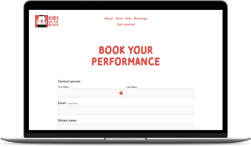
Absence of essential contact and volunteering application forms

New organization plan to reduce confusion and optimize the overall usability:
Streamlined homepage with no sidebar to guide users to sections
"Get Involved" menu item to bring all volunteering and donation-related items together
Less important information in the footer

Ideation and sketches
For the homepage, our objectives were to:
Make the design more lively and engaging with colors
Provide a clear and brief overview of the non-profit's activities
Build trust with visitors
Clearly guide users towards key actions such as booking a show, making donations, or volunteering


Mid-fidelity wireframes and colors
In creating the wireframes, our primary challenge lay in selecting and employing colors across the website:
We opted for a reddish-orange accent color due to its high saturation, ensuring visual impact
Yellow was chosen as a secondary color to maintain a lively and colorful atmosphere without overwhelming the user with crowded pages
Dark blue was utilized to emphasize specific sections, providing clarity within the design
Final designs
Project impact and feedback
The new website allowed the non-profit to kickstart their activity for 2023 by recruiting more volunteers and getting donations. They also received several bookings through the forms.
❝We were very impressed with her patience and diligence in setting everything up for us in such a short time.
- Sally Olsen, Coordinator
Learning
Challenges and lessons
Our initial problem statement, “users don't know how to perform the next action”, lacked depth. To address this, I researched and explored to finally reach the heart of the problem. This experience taught me the importance of always verifying that we're working on the correct problem first.
Managing changes, ideas, and functionalities across multiple screens proved challenging, leading to difficulty in tracking progress. I made sure I clarified the why of each idea to the team, and validated each feature individually. I learned to keep notes on the history and reasoning behind each decision.
Reaching a balance between functionality and aesthetics was hard given the constraints of tight deadlines and the sole use of high-fidelity wireframes. Going forward, I plan to prioritize functionality by utilizing medium-fidelity wireframes whenever I can.
What I would have done differently
Define clearer success metrics: although we received a lot of positive feedback from the user, it would have been better to formally measure this feedback in a more formal way
Implement some User Testing along with the team reviews
Next steps
The implementation of the design was split in 4 parts:
The quote details page
The quote list page
The status tracker
The upload document feature (on details screen)
My responsibility included the front-end development of the first three parts, which were executed successfully. The document upload required more coordination from other department teams and is on its way to be implemented. Additionally, we are in the process of reviewing the entire user journey to ensure simplicity and efficiency for both brokers and underwriters.
